Introduction
Globe 4 covers the fourth module of Finnish upper secondary school geography. The chapters of the book contain theory, map information and a wide range of exercises. These units help to prepare the student for writing a research paper or completing an advocacy project as part of the course.
In addition, the book helps to prepare the student for the geography matriculation exam.
What are maps?
A map is a reduced and generalised image of an area produced for a specific purpose. The map will always contain certain basic elements, such as scale and explanations of the markers, as well as information on which direction is north. Nowadays, maps are mostly used in digital form, but paper maps are still used for certain activities, such as hiking. Maps are an important tool for studying geographical regions.
A map is usually based on an aerial or satellite image, from which data is selected according to the situation. For example, on a road map, roads and travel routes are highlighted, whereas on a biogeographical map, roads may not be visible at all. In a thematic map, a simple map base is used to represent a statistic by means of map symbols or by colouring and rasterising areas of the map according to data from a particular statistic.
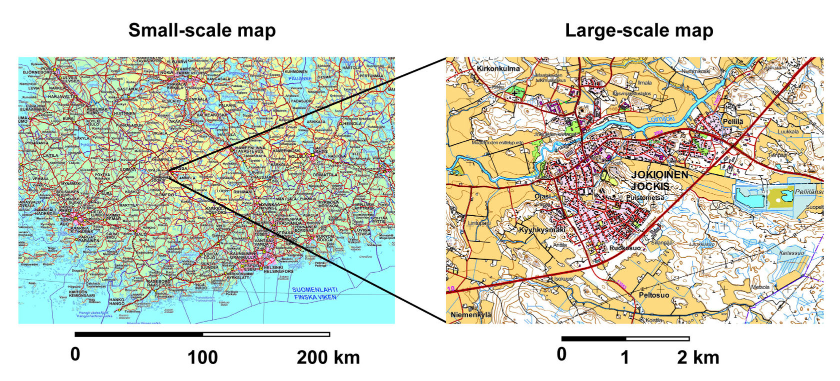
Scale is one of the most important features of a map. An accurate, large-scale (e.g. 1:20 000) map of a particular area shows much more detail than a small-scale (e.g. 1:90 000 000) world map. In a small-scale map, the fraction is small, i.e. the denominator of the fraction is large. A world map is a common example of a small-scale map. Due to generalisation, certain features of the terrain are not always shown on the map. For example, in world maps the shapes of coastlines are often simplified.
To use the line scale of a printed map, you need a ruler. If the scale line is 5 centimetres long and has the number 100 km on it, that means that 5 cm on the map corresponds to 100 km in the real world. This means that 1 cm on the map corresponds to 20 km in nature.
In a ratio scale, the same thing is expressed in the form of a ratio, where both figures are in centimetres. If the scale of a map is 1:250 000, then 1 cm on the map corresponds to 250 000 cm in the real world. This means that 1 cm on the map corresponds to 2.5 km in nature.
Coordinates and scale
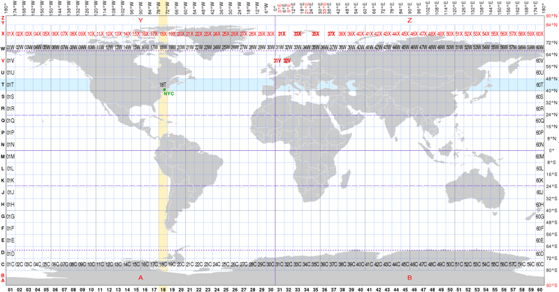
If someone asks you for advice on how to get somewhere, you might answer them with something along the lines of "Turn right at the corner of that shop and go a block further, and there's the flower shop". However, the best and most universal way to indicate one's location on a map is by using a coordinate system. A coordinate system is created by superimposing lines of longitude and latitude on a map, so that the location can be expressed in degrees or coordinates. The latitude, or distance from the equator, is always given first, followed by the longitude, or distance from the Greenwich meridian.
A plane coordinate system is a coordinate system formed on a plane. Different plane coordinate systems are used in different parts of the world. In Finland, for example, the plane coordinate system used is called ETRS-TM35FIN. In this system, the whole nation is described in a single coordinate system. The numbers in the north coordinate indicate the distance from the equator, and the numbers in the east coordinate indicate the distance in metres from the central meridian (longitude) of the global UTM coordinate system band. In the case of Finland, the central meridian used is the longitude 27°E.
Maps for different uses
The things that are marked on the map are always selected according to the map's purpose. For this reason, the same area can be represented differently on a terrain map, a road map and an aeronautical map.
A natural geography map displays the natural environment of the area, ignoring human activity. It can display differences in elevation, vegetation and bodies of water. An accurate large-scale base map (e.g. 1:20 000), on the other hand, shows a small area in rich detail.
A road map is exaggerated in terms of the size of the roads. Other things are presented in a way that matches the accuracy of the map, taking the needs of motorists and travellers into account.
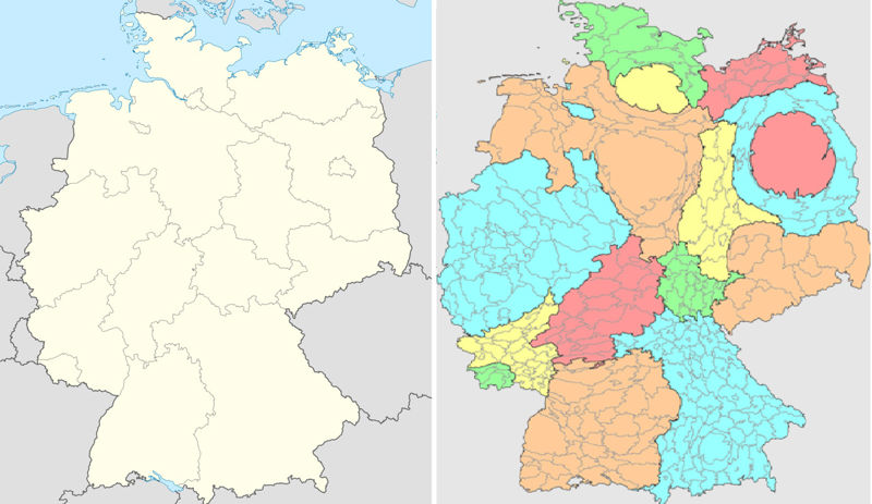
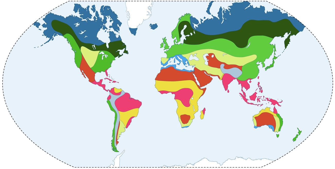
Sometimes the map only shows the boundaries of the areas, with the areas within the boundaries being coloured according to statistical information. Such a map is called a thematic map. Thematic maps are produced using geographic information software.
Maps in regional research projects
Self-made or modified maps are an essential part of geographic research. Maps can be made from existing data using geographic information software, drawn by hand and scanned, or taken from an online map library and edited using image editing software.
If you use a map base from the internet, the source of the original map and its web address must be indicated in the caption below the map. You must also have the necessary rights to use the map.
Maps are an important source material in regional studies. If you include a map in a course project, it must be interpreted and discussed in the text. The map should also be referred to in other parts of the project when describing different features of the area.
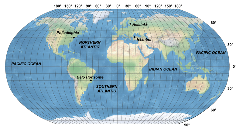
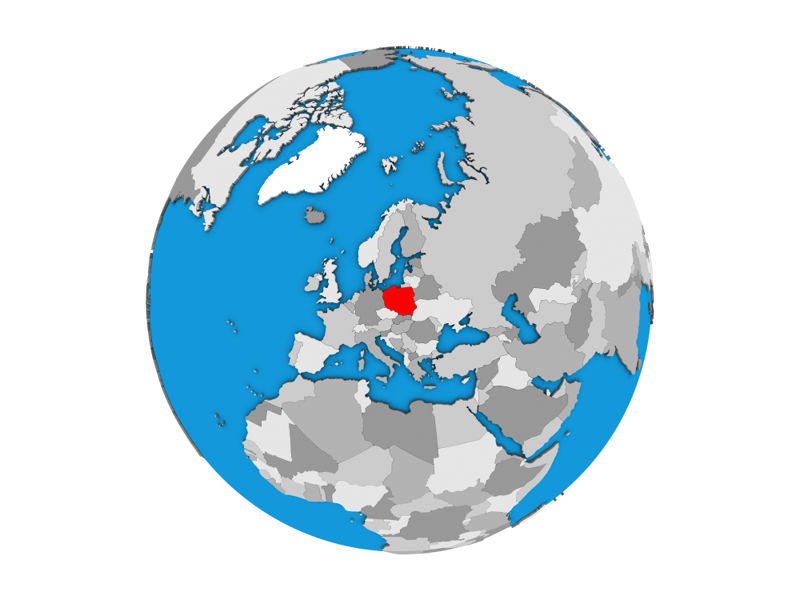
If your course project includes a section that discusses the location of a place or region, you should include an index map that highlights the location of the site in relation to the largest possible surrounding area. For example, if the subject of your project is a country, its location should be shown on a world map.
In your course project, it is also useful to include a general map of the area, showing the main natural geographic areas, localities and transport links. The natural geography of a region can be presented in more detail by using different kinds of maps, e.g. those focusing on vegetation and bodies of water.
The human activity that takes place in a region can be shown in more detail with maps focusing on transport networks or with thematic maps that display the distribution of the population. For such maps, the computer and geographic information software are excellent tools.
Different kinds of maps
Topographic map (i.e. physical map) – a versatile general map
Examples of topographic maps include:
- small-scale maps of countries, continents or the world.
- large-scale terrain maps.
- ordnance survey maps.
- maps made for a specific purpose, such as nautical charts and maps for camping and orienteering.
Thematic map – shows the occurrence of a phenomenon in the area
Examples of thematic maps include:
- maps focusing on the terrain types of a region, for example soil type maps.
- statistical thematic maps that connect spatial information with statistical information, such as dot maps, symbol maps, flow maps, coloured choropleth maps, weather maps and composite maps.
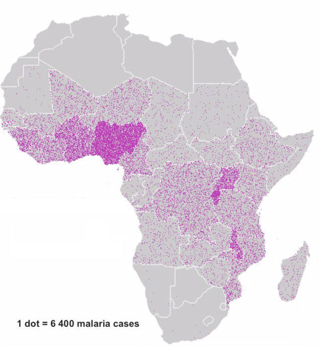
Dot and symbol maps
Dot maps can be used to display the prevalence or frequency of a certain phenomenon in different regions. For example, the accompanying dot map shows the prevalence of malaria, a disease caused by the protozoan parasite, in Africa. Malaria is virtually non-existent in northern and southern Africa. In some places, differences between neighbouring countries vary greatly. This may be due to data errors (different recording or reporting of cases, etc.).
Symbol maps can also be used to present the distribution of phenomena. In this case, differences in density and prevalence cannot be shown, but the main message of the map is easier to interpret than in a regular dot map.
Flow maps
In a flow map or line symbol map, a line symbol represents a direct connection between two points. Flow maps can also show various routes or relationships between two places. Different types of lines can be used to represent the direction and magnitude of a particular phenomenon, such as a migration flow.
Isarithm maps
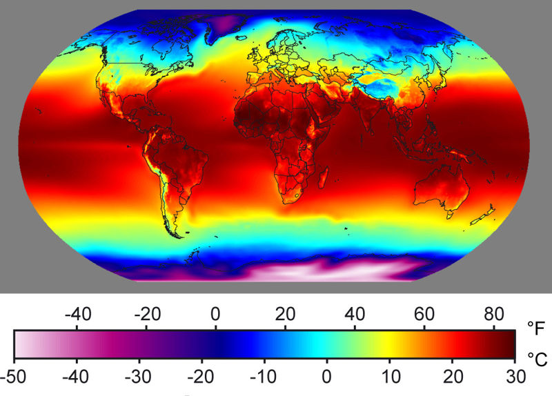
Isarithm maps are based on equivalence curves or isarithms. They are suitable for describing continuous statistical data (e.g. temperature, air pressure).
Isarithm maps are not suitable for describing discontinuous values, because it is not possible to construct equivalence curves for such values.
In an isarithm map, points of equal value are connected to each other to form a curve. The values of the observation points are the actual numerical values measured in these points. Examples of isarithm maps include temperature, altitude and depth maps.
Equivalent curves describing the air pressures in weather maps are called isobars. For an example, see this animation of the movement of a cold front. The curves shown on the map are isobars of barometric pressures.
The lines connecting the measurement points are usually rounded so that the locations of the observation points do not appear on the curve and the lines do not have sharp corners. Equivalence curves never cross or bifurcate with each other.
Area symbol maps
Area symbol maps are used to present the occurrence of regional phenomena. The information presented in spatial symbol maps can be qualitative or quantitative in origin.
Usually, the data is converted into a qualitative or ordinal scale. As there is a limit to the number of colour symbols that can be used, diagrams can also be added to the map.
Disadvantageous features of area symbol maps:
- Variation within regions is not displayed.
- Most phenomena do not follow regional boundaries.
- Area symbol maps exaggerate the changes in numerical values at category boundaries.
- Large areas are given great visual weight.
- Area symbol maps are only suitable for presenting relative data.
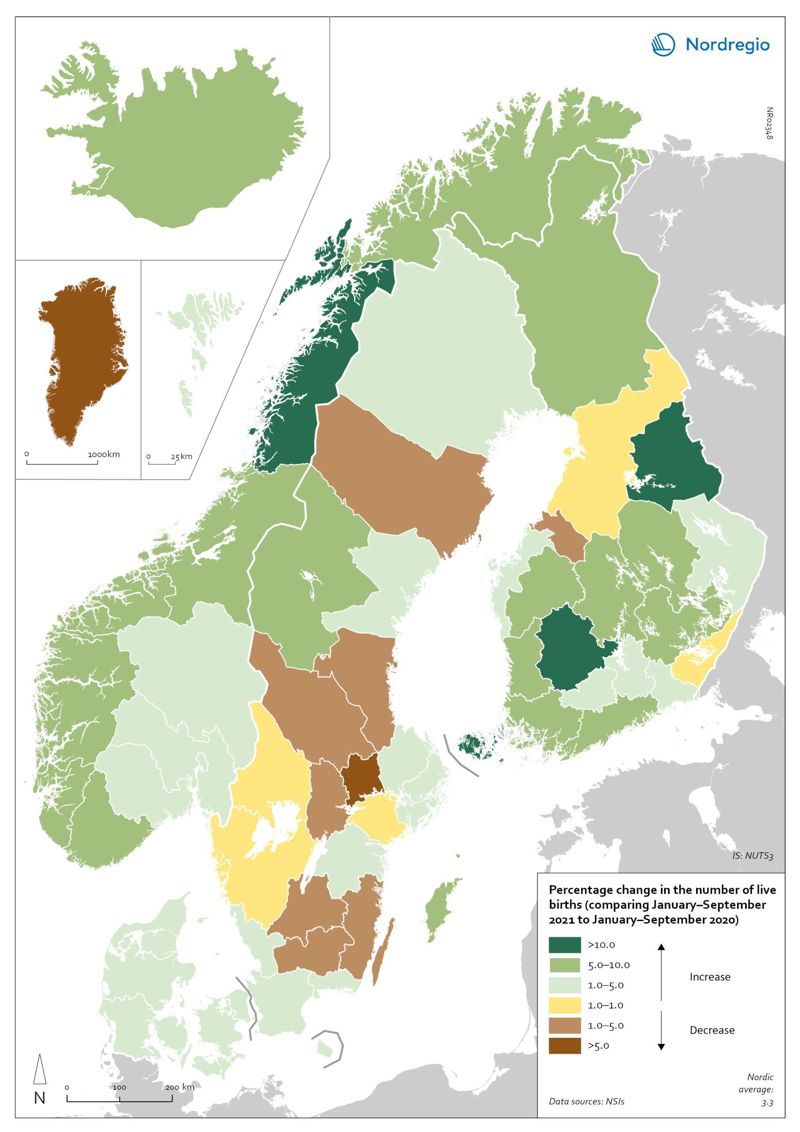
Choropleth maps display differences between regions using different colours. Choropleth maps are based on existing regional divisions, for example between provinces or municipalities. In a choropleth map, relative values are often shown in relation to the population as a whole.
In a choropleth map, different colours can be used to display contrasting trends between different regions. See the map of changes in the birth rates of the Nordic countries in the years 2020 and 2021 for an example.
Choropleth maps are the most commonly used type of area symbol map. Another common type is the grid map. In a grid map, where the statistical data is represented using coloured squares. In a grid map, the space is not divided according to existing regional divisions, but instead each square is identical in size.
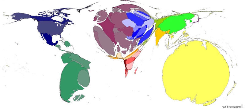
Cartograms
A cartogram is a thematic map in which the desired information is conveyed with the size of the area of the region, so that the size of the region is proportional to the value of the variable being described. In a cartogram, the sizes of regions are therefore determined by the variable rather than by geography.
Map projections
The purpose of map projections
Try to peel an apple or an orange so that the peels form a rectangular pattern. Alternatively, you can try to wrap a large sheet of paper tightly around the surface of the map so that it doesn't wrinkle.
You'll soon find that neither can be done. Drawing the surface of Earth on paper is not without problems either: you can't draw the globe on a plane without distortions.
Map projection is a method of representing (projecting) the surface of the Earth onto a surface, such as a plane, a cylinder or a cone.
When reading maps, it is important to understand that, as a result of map projection, one thing on a map can be truer than another. The same thing can look very different on different maps.
Equal-angle projection
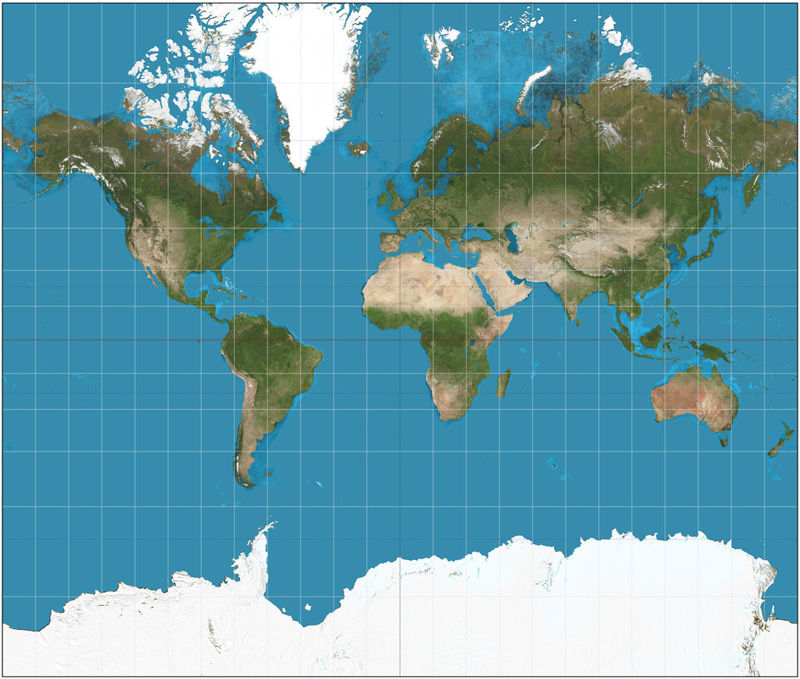
In equal-angle maps, the angles between the cardinal directions are correct. The equal-angled Mercator projection was first used in navigation as early as the Middle Ages. It was good for navigating, as you could take a compass heading even when travelling on open seas.
However, navigators had to take into account that the scale varies in different parts of the Mercator map: 1 cm of a map near the equator is a much longer distance in nature than 1 cm of the map measured near the North Pole.
This explains why, in the Mercator projection, areas near the planet’s poles look disproportionately large and areas near the centre of the map, such as Africa, seem disproportionately small.

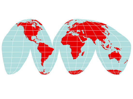
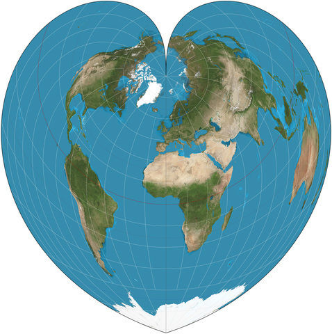
Equal-area projection
Equal-area maps correctly show the surface areas of various regions, such as continents. These maps are used, for example, to represent different parts of the globe.
The problem with using an equal-area map is that the shapes of continents do not correspond to what they would look like when viewed from space or on a globe.
Equal-distance projection
In equal-distance maps, distances from a specific point on the planet’s surface are represented correctly. For example, airlines use such maps to show their flight routes to different parts of the world.
Study real-time flight data on the Flightradar air traffic website. Click on any aircraft flying over the North Atlantic to study its flight route. This route choice is easy to understand when you look at a map of the world where distances are displayed correctly. Looking at the Mercator map would lead to a completely different choice of route!
In an equal-distance map, the angles between the cardinal directions and the surface areas of continents are incorrect.
Maps that combine different projections
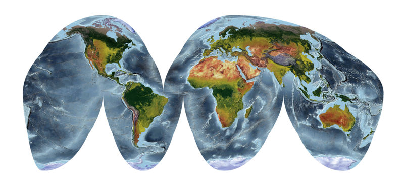
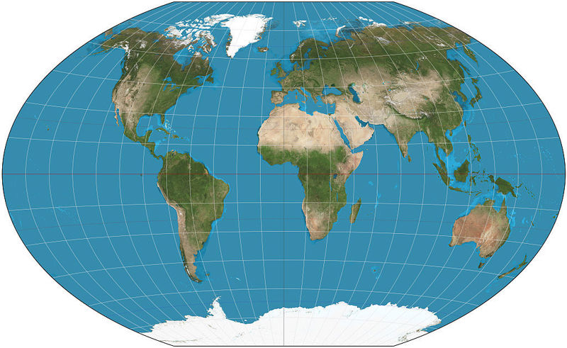
Many maps combine the features of different projections. In other words, such a map is not quite right about anything, but the distortions in areas and directions, for example, are not detrimental. An example of such a projection is the Robinson projection, now commonly used in world maps.
Satellite images
Alongside traditional maps, satellite imagery is nowadays used to present geographical information.
a) The equator is rich in deserts because the sun often shines perpendicularly from above.
b) Casablanca and Perth are located in the Mediterranean vegetation biome.
c) Kenya is mostly savanna.
d) Chile is located in the southern hemisphere.
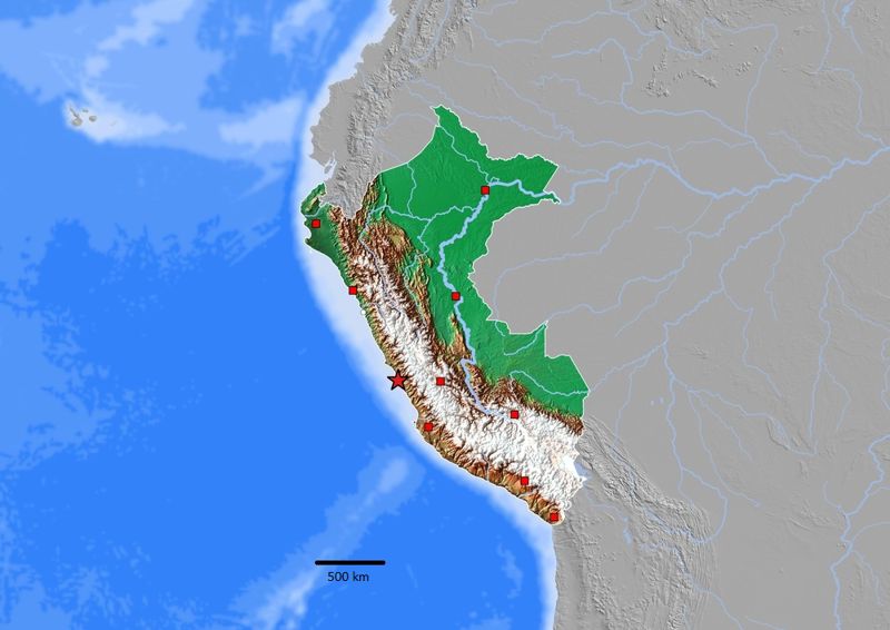
e) Lima, the capital of Peru, is located on the Atlantic coast.
Summary
- Topographic maps represent the real world. Physical maps include small-scale regional maps as well as large-scale terrain maps.
- Thematic maps describe the occurrence of a particular phenomenon. Bedrock maps and population density maps are examples of thematic maps.
- The location of places on the planet can be indicated by coordinates.
- Map projections are used to translate the surface of the onto a two-dimensional plane.