A map is a representation of a territory
A map is a reduced and simplified image of a territory.
Things found in the terrain are represented on the map as symbols. The scale of a map portrays distances by telling you how many real-world centimetres one centimetre on the map represents.
Because the planet Earth is round and maps are often two-dimensional, some amount of accuracy must always be sacrificed when making a map. As a result, things like the shapes of the different continents and distances between them are often a little bit off on two-dimensional world maps.
You can understand the difficulty of representing planet Earth on a two-dimensional map by peeling an apple and laying its skin on a flat surface. You will notice that the peel does not form a flat rectangle. Instead, it leaves empty spaces near its edges. This problem is not found with globes, as they replicate the planet's globular shape.
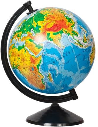
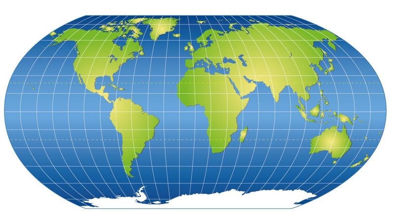
Study the world map!
Use the world map to answer the following questions
- Can you see where the equator is?
- Turn the map into a position that is centred on the Arctic Pole. Can you find Finland or Florida?
- Turn the map into a position that is centred on the Antarctic Pole. Can you discern the southernmost tip of South America? What about Australia?
Different map projections
Although globes are accurate, they are not as practical as two-dimensional, printed maps. Because of this, geographers have developed different map projections. Map projections strive to present the world’s terrain on a two-dimensional plane as accurately as possible.
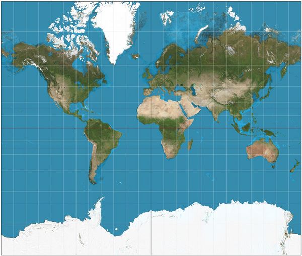
The Mercator projection is a widely-used map projection because it accurately replicates the shapes of the continents. It was originally developed to help sailors navigate the world's oceans. However, the downside of the Mercator projection is that it makes areas near the planet’s polar regions seem larger than they actually are. As a result, when using the Mercator projection, Antarctica looks like the largest continent in the world.
In the Robinson projection, the surface areas are almost correct everywhere in the world, but the shapes of the continents are somewhat askew. Because of this, it is important to keep in mind that two-dimensional maps never portray the real world completely accurately. For example, both the Mercator projection and the Robinson projection present Antarctica inaccurately.
In autumn 2026, the UN approved a proposal for a new map projection designed to replace the old Mercator and Robinson projections. The new Equal Earth projection resembles the Robinson projection in appearance, but preserves the relative areas of the regions. As a result, the proportions of Africa, for example, are correct on the map.
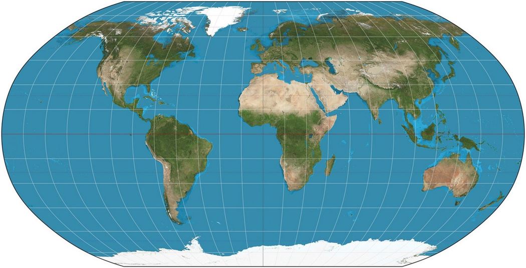
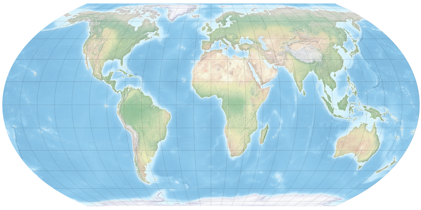
(© Juha Salminen)
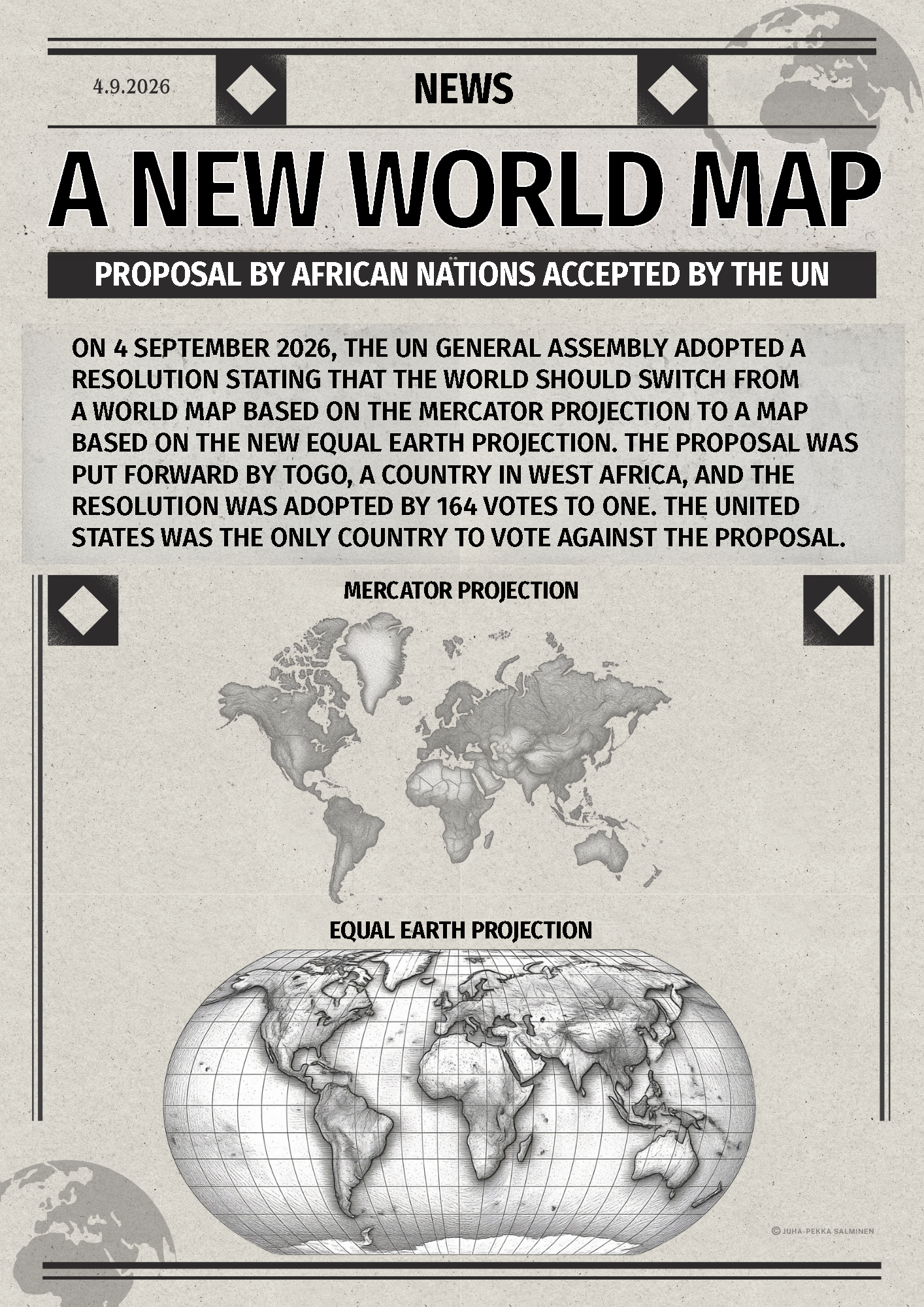
1. The new map reform was supported
- especially by the United States.
- especially by Asian nations.
- especially by African nations.
- only by a minority of UN member nations.
2. On a map that uses the Equal Earth projection,
- Africa is more truthfully represented than on a Mercator map.
- Finland appears bigger than on a Mercator map.
3. The Equal Earth projection was originally designed to help sailors navigate the Earth's oceans.
- True
- False
3. The Mercator projection was originally designed to help sailors navigate the Earth's oceans.
- True
- False
5. The Equal Earth projection provides a more accurate representation of the sizes of the continents and countries.
- True
- False
Latitudes and longitudes
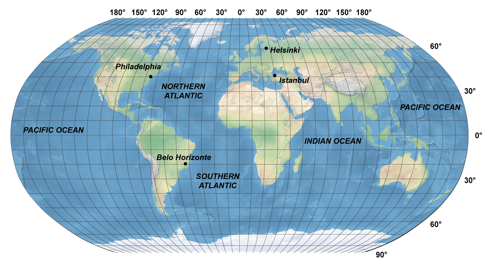
When you look at a world map, you will notice horizontal and vertical lines running across the Earth. The horizontal lines, running between from west to east, are called latitudes. The latitudes travel in the same direction without ever touching each other. The longest of these lines is the equator, which divides planet Earth into its northern (N) and southern (S) hemispheres. The latitude of the equator is marked as 0 degrees.
When moving away from the equator in either northward or southward direction, the degrees of latitude begin to increase. The latitude of the North Pole is 90° N, whereas the latitude of the South Pole is 90° S.
The vertical lines on the map run between the planet's North and South Poles. They are called longitudes. The zero longitude is marked to run through London's Greenwich, and is called the Greenwich meridian. It divides the planet into eastern (E) and western (W) hemispheres.
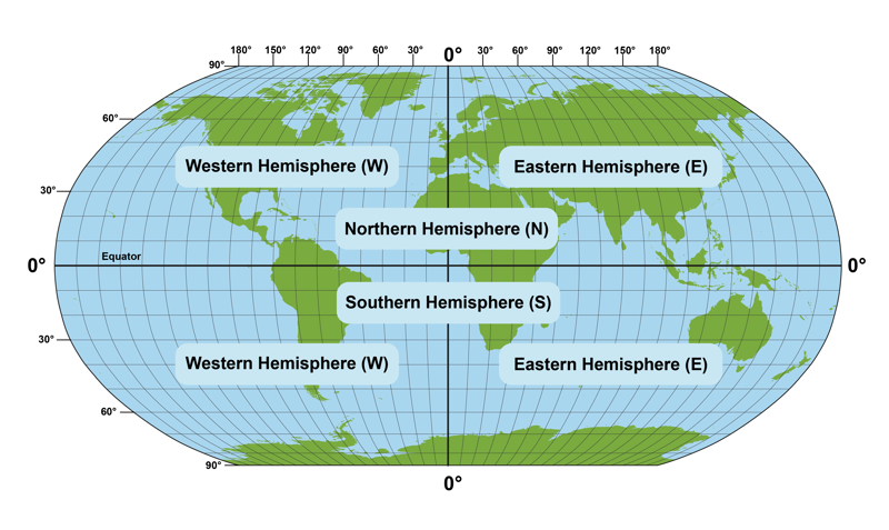
Because the perimeter of a round object is 360 degrees and the Greenwich meridian divides our planet in half, the largest possible longitude is 180°. The longitudes of 180° E and 180° W meet each other on the opposite side of the planet from Greenwich, in the middle of the Pacific Ocean.
The Greenwich meridian is also the basis for the Earth's time zone system. All clock times on planet Earth are compared to Greenwich Mean Time (GMT) or Coordinated Universal Time (UTC). The place where the longitudes of 180° E and 180° W meet is called the date line. When moving over this line, you will move to the next or the previous day (depending on the direction you are travelling) because of the time zone system.
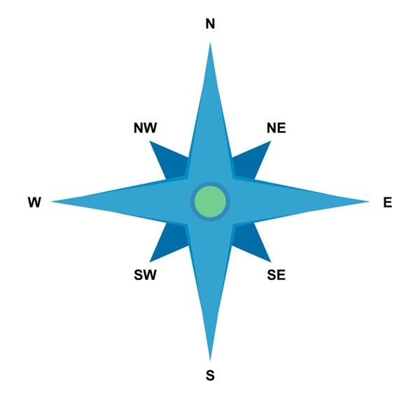
- N =
- NE =
- E =
- SE =
- S =
- SW =
- W =
- NW =
- N =
Coordinates determine your location on the map
When the lines of latitude and longitude are placed on a map, a coordinate grid is formed. As a result, a location on the map can be presented as degrees of latitude and longitude. Together, these two values give the location's coordinates.
The latitude, or distance from the equator, is always presented first. The longitude, or distance from the Greenwich meridian, is always presented second.
The scale helps you calculate distances
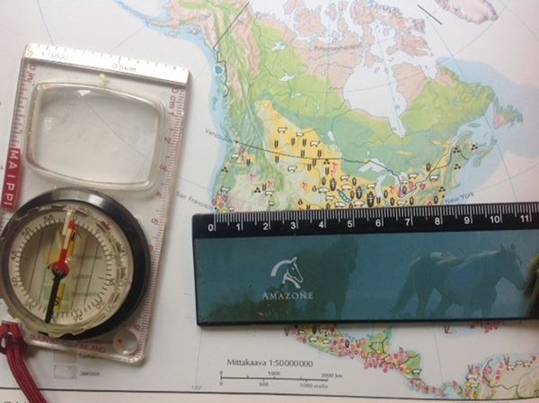
If you want to find out the distance between two places on a map, you need to make use of the map’s scale. It may be presented either in the form of a bar scale or as a ratio.
To use a bar scale, you need the help of a ruler. If the bar is 5 centimetres long and contains the number 100 km, this means that 5 cm on the map represents 100 km in the real world. In other words, 1 cm on the map is the same as 20 km in the real world.
The scale of a map can also be presented in the form of a ratio. The ratio shows the relation between a centimetre on the map and a centimetre in the real world. For example, if the map has a scale of 1 : 250 000, 1 cm on the map represents 250 000 cm in the real world. When you convert this number to kilometres, you will see that 1 cm on the map represents 2,5 km in the real world.
Satellite images
Over the last couple of decades, satellite images have become a reliable way of presenting geographical information. These images are taken by cameras that are located inside satellites, which are devices that have been launched into planet Earth's orbit.
Below, you can find a satellite image of Europe.
Satellite images provide many kinds of useful geographical data. They are particularly useful when studying population density, as can be seen when looking at the video below.
Finnish maps
There are many kinds of maps for studying Finnish geography.
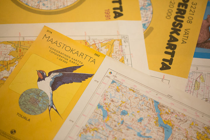
The scale of Finnish base maps is 1:25 000 (in older maps, 1:20 000). This means that 1 cm on the map corresponds to 25 000 cm, or 250 metres, on the ground. Base maps show features such as roads, buildings, waterways, fields, landforms and changes in elevation, as well as protected areas.
Finnish topographic maps have a scale of 1:50 000. They provide a more general view of the terrain than base maps. A topographic map is less accurate than a base map, but it can cover a larger area using a single map sheet.
These two kinds of maps are no longer printed in large quantities, as people have switched to using digital maps.
Summary
- A map is a reduced, simplified image of a territory.
- A map should always include a scale, so that the distances between different places can be calculated.
- Different map projections strive to present Earth on a two-dimensional plain as accurately as possible.
- The equator divides planet Earth into northern (N) and southern (S) hemispheres.
- The Greenwich zero meridian divides planet Earth into eastern (E) and western (W) hemispheres.
- Latitudes run over the Earth horizontally, and their degree values can range from 0 (the equator) to 90 (the North and South Poles).
- Longitudes run over Earth vertically, and their degree values can range from 0 (Greenwich) to 180 (the Pacific date line).
- Together, the lines of altitude and longitude form a coordinate grid. This makes it possible to present locations on the planet with coordinates.